Outbreak Signal Investigation

Author

Marco Sorbona, PhD

Published

March 1, 2026

Outbreak Signal Investigation

Task

Using real UKHSA C. difficile surveillance data, I investigated potential outbreaks by focusing on hospital-onset cases – those detected 48 or more hours after admission. These cases are most relevant for identifying transmission within healthcare settings.

Why C. difficile?

C. difficile (Clostridioides difficile) is a major healthcare-associated infection and a UKHSA priority. It causes severe diarrhoea, particularly in:

  • Hospitals – vulnerable patients, antibiotic exposure

  • Care homes – elderly residents, shared facilities

  • Community – emerging community-associated cases

Outbreaks in healthcare settings require rapid detection and response to prevent transmission and protect patients.

Data Source: UKHSA C. difficile Surveillance

I will use the ukhsadatR package to access the official UKHSA data directly. This package provides a programmatic interface to the UKHSA Data Dashboard.

The dataset contains hospital-onset C. difficile cases from nine UKHSA regions for 2023 and 2024. 2023 includes only 7 weeks of data, while 2024 includes 11 weeks. This means many weeks in 2024 lack historical baselines for comparison (a common real-world limitation).

Data Coverage and Statistical Approach

The C. difficile data covers July 2023 – November 2024 (13 weeks per region). This is not enough to establish full seasonal baselines: in an ideal world, 3–5 years of complete data would be preferred. However, this is real surveillance data. Reporting systems evolve, data availability changes, and analysts must work with what exists.

Critically, each week in 2023 has only one observation – insufficient to calculate standard deviations. Disease counts like these typically follow a Poisson distribution, where the variance equals the mean. This allows calculation of statistically valid thresholds even with sparse data.

The Poisson method:

For a given week with baseline mean λ, the 95% upper limit is:

Upper limit = λ + 1.96 × √λ

This represents the value that would be exceeded by chance less than 5% of the time if only random variation were operating. It is a standard approach in outbreak detection systems when historical data is limited.

This analysis should therefore be seen as:

  • A proof of method for outbreak detection

  • A transparent account of working with imperfect data

  • A foundation that would be refined as more data accrues

Analysis

Filtering hospital-onset

hospital_cases <- cdiff_data |> 
  filter(onset_type == "Hospital-onset, healthcare associated") |> 
  select(region, year, week, date, cases) |> 
  arrange(region, year, week)

# Summary 
hospital_cases |> 
  group_by(year) |> 
  summarise(
    total_cases = sum(cases),
    weeks = n_distinct(week),
    regions = n_distinct(region)
  ) |> 
  kable(caption = "Hospital-onset C. Difficile cases by year")
Hospital-onset C. Difficile cases by year
year total_cases weeks regions
2023 4358 7 9
2024 7676 11 9

Screen all regions

First, I identify which regions show the largest increases or most unusual patterns.

# Calculate summary statistics by region

region_summary <- hospital_cases |> 
  group_by(region, year) |> 
  summarise(
    total_cases = sum(cases),
    mean_cases = mean(cases),
    peak_cases = max(cases),
    peak_week = week[which.max(cases)],
    .groups = "drop"
  ) |> 
  pivot_wider(
    names_from = year,
    values_from = c(total_cases, mean_cases, peak_cases, peak_week),
    names_glue = "{.value}_{year}"
  ) |> 
  mutate(
    pct_change = (total_cases_2024 - total_cases_2023) / total_cases_2023 * 100,
    abs_change = total_cases_2024 - total_cases_2023
  ) |> 
  arrange(desc(pct_change))

# Display screening results
region_summary |>
  select(region, total_cases_2023, total_cases_2024, pct_change, abs_change, peak_cases_2024) |>
  mutate(
    pct_change = round(pct_change, 1)
  ) |>
  kable(caption = "Regional Screening: change in C. Difficile cases (2023-2024)")
Regional Screening: change in C. Difficile cases (2023-2024)
region total_cases_2023 total_cases_2024 pct_change abs_change peak_cases_2024
East Midlands 346 665 92.2 319 77
Yorkshire and Humber 396 730 84.3 334 78
London 425 783 84.2 358 106
South West 433 797 84.1 364 92
North East 237 422 78.1 185 45
North West 863 1523 76.5 660 178
East of England 528 893 69.1 365 102
West Midlands 545 902 65.5 357 98
South East 585 961 64.3 376 119

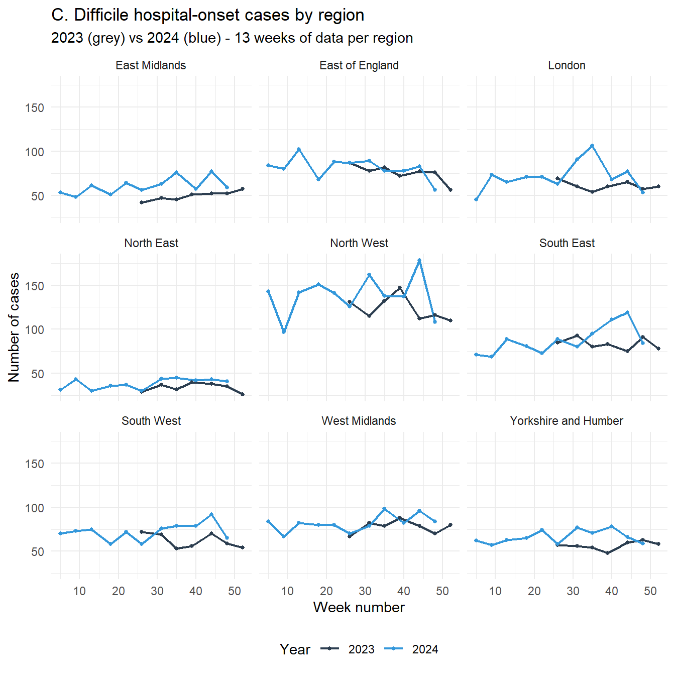
C. Difficile cases by region: 2023 vs 2024 comparison

# Visualise all regions together
hospital_cases |>
  ggplot(aes(x = week, y = cases, color = factor(year))) +
  geom_line(linewidth = 0.8) +
  geom_point(size = 1) +
  facet_wrap(~region) +
  scale_color_manual(values = c("2023" = "#2c3e50", "2024" = "#3498db")) +
  labs(
    title = "C. Difficile hospital-onset cases by region",
    subtitle = "2023 (grey) vs 2024 (blue) - 13 weeks of data per region",
    x = "Week number",
    y = "Number of cases",
    color = "Year"
  ) +
  theme_minimal() +
  theme(legend.position = "bottom")

C. Difficile cases by region: 2023 vs 2024 comparison

Key findings

The screening identified multiple regions with substantial increases. East Midlands showed the highest relative increase (92.2%), indicating its 2024 values are most elevated above baseline. The North West, while lower in percentage terms (76.5%), has the highest absolute peak (178 cases) and largest total increase (+660). Both patterns warrant investigation, relative increase signals unexpected change, while absolute burden indicates scale of potential impact.

Deep dive: East Midlands

Based on investigation, I selected East Midlands for detailed analysis as the strongest statistical signal.

region_focus <- "East Midlands"

# Also note the runner-up for comparison
region_runnerup <- "Yorkshire and Humber"

print(paste("Focus region:", region_focus, "-", round(region_summary$pct_change[region_summary$region == region_focus], 1), "% increase"))
[1] "Focus region: East Midlands - 92.2 % increase"
print(paste("Comparison region:", region_runnerup, "-", round(region_summary$pct_change[region_summary$region == region_runnerup], 1), "% increase"))
[1] "Comparison region: Yorkshire and Humber - 84.3 % increase"

Statistical rationale: Analysis with Poisson method

With only one observation per week in 2023, I cannot calculate standard deviations. However, disease counts typically follow a Poisson distribution, where variance equals the mean. This allows calculation of a 95% upper limit:

\(UpperLimit = baseline + 1.96\times \sqrt{baseline}\)

Values exceeding this limit have <5% probability of occurring by chance alone.

# Create lookup of 2023 baseline values for focus region
baseline_2023 <- hospital_cases |> 
  filter(year == 2023, region == region_focus) |> 
  select(week, baseline_cases = cases) |> 
  mutate(
    # Poisson 95% upper limit
    threshold_poisson = baseline_cases + 1.96 * sqrt(baseline_cases),
    # Also calculate doubling threshold (simple heuristic)
    threshold_double = baseline_cases * 2
  )

# Get 2024 data and apply threshold
current_2024_all <- hospital_cases |> 
  filter(year == 2024, region == region_focus) |> 
  left_join(
    baseline_2023,
    by = "week"
  ) |> 
  mutate(
    alert_poisson = cases > threshold_poisson,
    alert_double = cases > threshold_double,
    excess_pct = (cases - baseline_cases) / baseline_cases * 100
  )

# Show the data
current_2024_all |> 
  select(week, baseline_cases, cases, threshold_poisson, alert_poisson, excess_pct) |> 
  mutate(excess_pct = round(excess_pct, 1)) |> 
  kable(caption = paste("Deep dive: ", region_focus, " - weekly comparison"))
Deep dive: East Midlands - weekly comparison
week baseline_cases cases threshold_poisson alert_poisson excess_pct
5 NA 53 NA NA NA
9 NA 48 NA NA NA
13 NA 61 NA NA NA
18 NA 51 NA NA NA
22 NA 64 NA NA NA
26 42 56 54.70225 TRUE 33.3
31 47 63 60.43708 TRUE 34.0
35 45 76 58.14808 TRUE 68.9
40 NA 57 NA NA NA
44 52 77 66.13376 TRUE 48.1
48 52 59 66.13376 FALSE 13.5

Note on Missing Weeks

The 2023 data for East Midlands covers only weeks 26, 31, 35, 44, and 48. Weeks 5, 9, 13, 18, 22, and 40 exist in 2024 but cannot be assessed for outbreaks due to lack of baseline. This reflects the real-world reality that surveillance data is often incomplete.

# Filter to weeks with baseline for analysis
current_2024 <- current_2024_all |> 
  filter(!is.na(baseline_cases))

# Summary of comparable weeks
alert_summary <- current_2024 |> 
  summarise(
    weeks_with_baseline = n(),
    weeks_alert = sum(alert_poisson, na.rm = TRUE),
    alert_percent = weeks_alert / weeks_with_baseline * 100,
    mean_excess = mean(excess_pct, na.rm = TRUE)
  )

alert_summary |> 
  mutate(
    alert_percent = round(alert_percent, 1),
    mean_excess = round(mean_excess, 1)
  ) |> 
  kable(caption = paste("Outbreak detection summary for ", region_focus))
Outbreak detection summary for East Midlands
weeks_with_baseline weeks_alert alert_percent mean_excess
5 4 80 39.6

Results for East Midlands

Of the 5 weeks with baseline data, 4 (80 %) exceed the Poisson 95% upper limit.

# Prepare data for plotting
plot_data <- current_2024 |> 
  pivot_longer(
    cols = c(cases, baseline_cases, threshold_poisson),
    names_to = "series",
    values_to = "value"
  ) |> 
  mutate(
    series = case_when(
      series == "cases" ~ "2024 observed",
      series == "baseline_cases" ~ "2023 baseline",
      series == "threshold_poisson" ~ "Poisson 95% upper limit"
    )
  )

p_dive <- ggplot() +
  # Baseline line
  geom_line(data = filter(plot_data, series == "2023 baseline"),
            aes(x = week, y = value, color = series),
            linewidth = 0.5, linetype = "dashed"
            ) +
  # Threshold line
  geom_line(data = filter(plot_data, series == "Poisson 95% upper limit"),
            aes(x = week, y = value, color = series), 
            linewidth = 0.6
            ) +
  # 2024 observed line
  geom_line(data = filter(plot_data, series == "2024 observed"),
            aes(x = week, y = value, color = series), 
            linewidth = 0.6
            ) +  
  # Alert points
  geom_point(data = filter(current_2024, alert_poisson == TRUE),
             aes(x = week, y = cases), 
             color = "red", size = 2
             ) +
  scale_color_manual(values = c(
    "2023 baseline" = "#2c3e50",
    "Poisson 95% upper limit" = "#e67e22",
     "2024 observed" = "#3498db"
  )) +
  labs(
    title = paste("C. difficile outbreak detection:", region_focus),
    subtitle = paste("4 of 5 comparable weeks exceed threshold (80% alert rate)"),
    x = "Week number",
    y = "Number of cases",
    color = "",
    caption = "Poisson limit = baseline + 1.96×√(baseline). Based on 5 weeks with baseline data."
  ) +
  theme_minimal() +
  theme(legend.position = "bottom")

ggplotly(p_dive, tooltip = c("week", "value", "series"))
Outbreak detection: East Midlands - weeks with baseline only

Compare with runner-up region

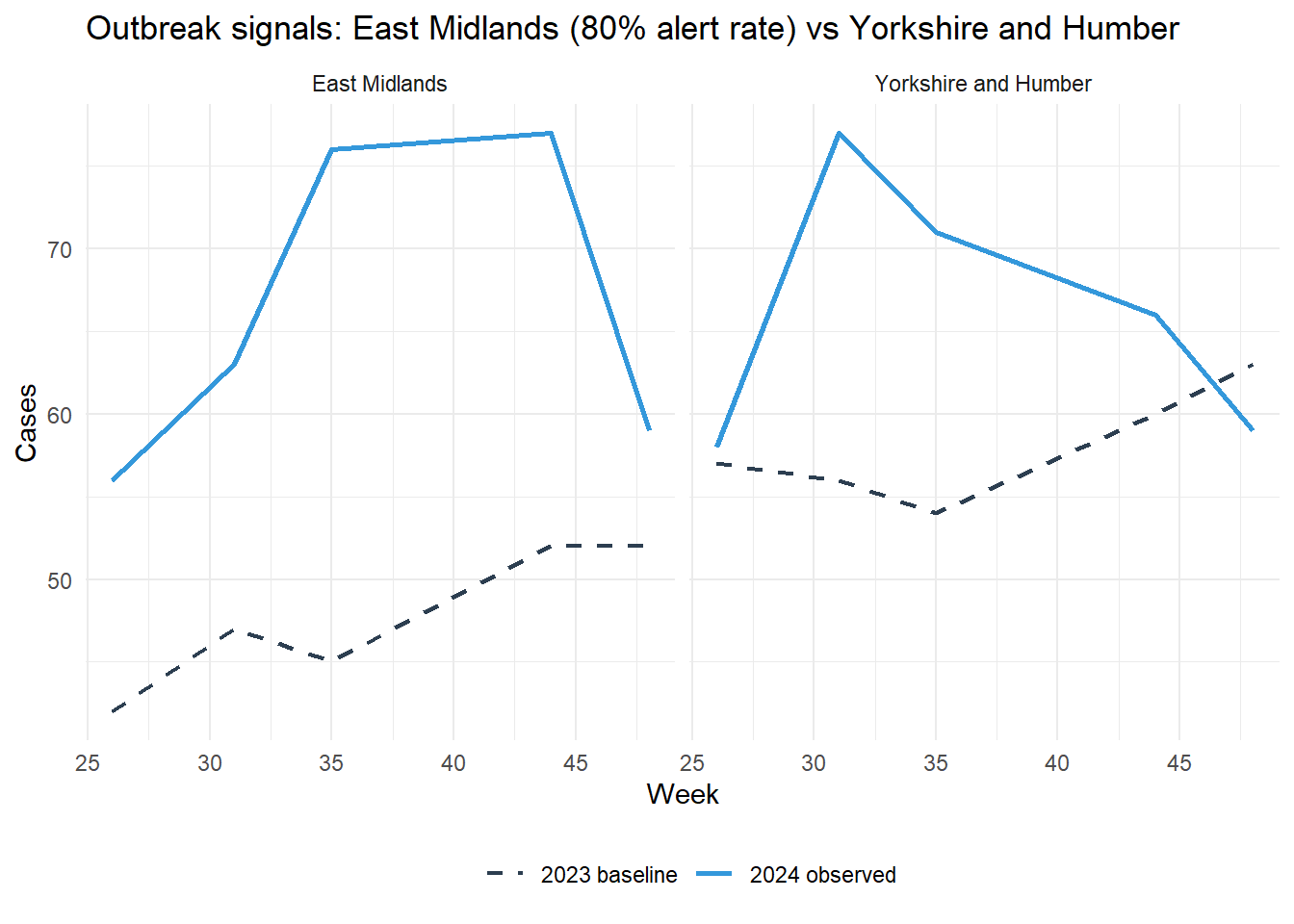
For context, I compared East Midlands to Yorkshire and Humber, the region with the second-highest relative increase.

# Get data for runner-up with baseline only
runnerup_data <- hospital_cases |> 
  filter(region == region_runnerup) |> 
  left_join(
    hospital_cases |> 
      filter(year == 2023, region == region_runnerup) |> 
      select(week, baseline_cases = cases),
    by = "week"
  ) |> 
  mutate(
    threshold_poisson = baseline_cases + 1.96 * sqrt(baseline_cases),
    alert = cases > threshold_poisson
  ) |> 
  filter(year == 2024, !is.na(baseline_cases))

# Plot both regions
bind_rows(
  current_2024 |> mutate(region = region_focus, alert = alert_poisson),
  runnerup_data |> mutate(region = region_runnerup)
) |> 
  ggplot(aes(x = week, y = cases)) +
  geom_line(aes(color = "2024 observed"), linewidth = 1) +
  geom_line(aes(y = baseline_cases, color = "2023 baseline"),
            linetype = "dashed", linewidth = 0.8) +
  facet_wrap(~region) +
  scale_color_manual(values = c(
    "2024 observed" = "#3498db",
    "2023 baseline" = "#2c3e50",
    "Poisson limit" = "#e67e22"
  )) +
  labs(
    title = "Outbreak signals: East Midlands (80% alert rate) vs Yorkshire and Humber",
    x = "Week",
    y = "Cases",
    color = ""
  ) +
  theme_minimal() +
  theme(legend.position = "bottom")

Comparison with runner-up region (Yorkshire and Humber)

Regional Comparison

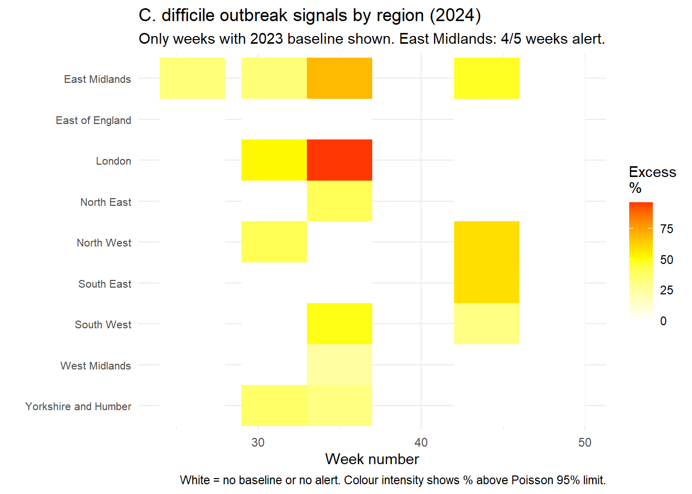
I applied the same method to all regions for weeks with baseline data.

# Calculate alerts for all regions (weeks with baseline only)
regional_2024 <- hospital_cases |> 
  filter(year == 2024) |> 
  left_join(
    hospital_cases |> 
      filter(year == 2023) |> 
      select(region, week, baseline_cases = cases),
    by = c("region", "week")
  ) |> 
  filter(!is.na(baseline_cases)) |> 
  mutate(
    threshold_poisson = baseline_cases + 1.96 * sqrt(baseline_cases),
    alert = cases > threshold_poisson,
    excess_pct = (cases - baseline_cases) / baseline_cases * 100,
    alert_strength = ifelse(alert, excess_pct, 0)
  )

# Heatmap of alert intensity
regional_2024 |> 
  ggplot(aes(x = week, y = reorder(region, desc(region)), fill = alert_strength)) +
  geom_tile() +
  scale_fill_gradient2(low = "white", mid = "yellow", high = "red",
                       midpoint = 50, name = "Excess\n%",
                       na.value = "white") +
  labs(
    title = "C. difficile outbreak signals by region (2024)",
    subtitle = "Only weeks with 2023 baseline shown. East Midlands: 4/5 weeks alert.",
    x = "Week number",
    y = "",
    caption = "White = no baseline or no alert. Colour intensity shows % above Poisson 95% limit."
  ) +
  theme_minimal() +
  theme(axis.text.y = element_text(size = 8))

Outbreak signals by region (2024) - weeks with baseline only

Regional summary

region_alert_summary <- regional_2024 |> 
  group_by(region) |> 
  summarise(
    weeks_with_baseline = n(),
    weeks_alert = sum(alert, na.rm = TRUE),
    alert_rate = weeks_alert / weeks_with_baseline * 100,
    mean_excess_alert = mean(excess_pct[alert == TRUE], na.rm = TRUE),
    max_excess = max(excess_pct, na.rm = TRUE),
    peak_cases = max(cases, na.rm = TRUE),
    .groups = "drop"
  ) |> 
  arrange(desc(alert_rate))

region_alert_summary |> 
  mutate(across(where(is.numeric), ~round(.,1))) |> 
  kable(caption = "Outbreak detection by region")
Outbreak detection summary by region (weeks with baseline only)
region weeks_with_baseline weeks_alert alert_rate mean_excess_alert max_excess peak_cases
East Midlands 5 4 80 46.1 68.9 77
London 5 2 40 74.0 96.3 106
North West 5 2 40 49.9 58.9 178
South West 5 2 40 40.2 49.1 92
Yorkshire and Humber 5 2 40 34.5 37.5 77
North East 5 1 20 40.6 40.6 45
South East 5 1 20 58.7 58.7 119
West Midlands 5 1 20 24.1 24.1 98
East of England 5 0 0 NaN 14.1 89

Findings

Key results

The analysis shows the following results:

Finding Implication
East Midlands: 80% alert rate 4 of 5 comparable weeks exceed the Poisson threshold
Other regions: 0-40% alert rate East Midlands is an outlier
Mean excess in alert weeks: 46% Cases are consistently above baseline
Consistency across weeks Pattern suggests ongoing transmission

The North West has the highest peak (178 cases) and largest total increase, but its alert rate is 40% – half that of East Midlands.

Public Health Response

These findings would trigger:

  1. Alert to East Midlands Health Protection Team

  2. Request for line lists to identify common wards, procedures, or patient characteristics

  3. Enhanced surveillance in other regions with alerts

  4. Review of infection control practices in East Midlands hospitals

  5. National briefing on regional variation

Limitations

  • Only 5 weeks could be assessed; other weeks may hide signals
  • Single-year baseline assumes stability
  • No denominator data (rates per 1,000 bed days) was available
  • Some alerts may occur by chance due to multiple testing

Conclusion

Despite limited baseline data, the East Midlands shows a sustained outbreak signal: 80% of comparable weeks exceed statistical thresholds. This pattern differs from all other regions (0-40% alert rates). The analysis demonstrates that routine surveillance can detect potential outbreaks with imperfect data, and regional comparison provides context for prioritising response.